Openwords Logo Design, Round 2
This is the second round of voting on logo concepts. You've voted for several different designs. Now it is time to chose among the favorite concepts.
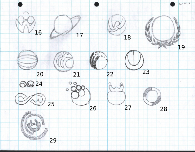
Below are illustrated those designs that have received several votes. Please choose *three* of the designs below. Send me your votes via email Marc.Bogonovich@Openwords.com
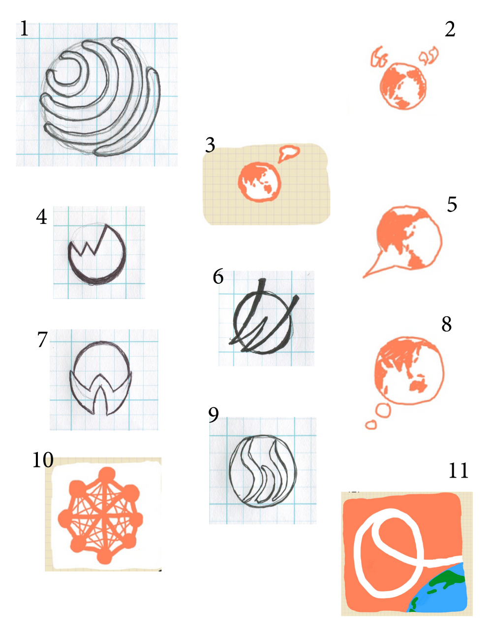
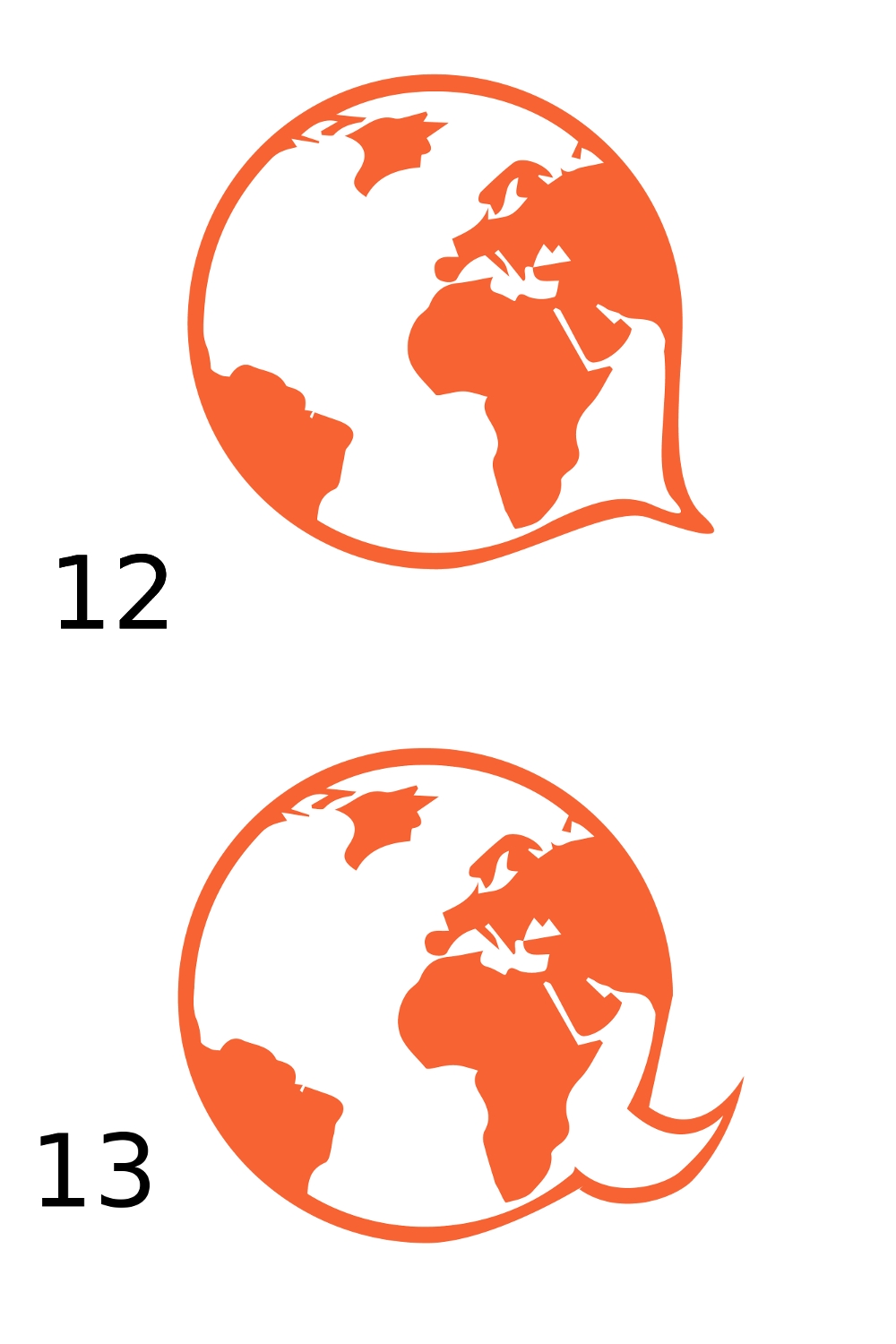
But first an explanation of the designs. Designs numbers 2, 3, 5, 8, 12, and 13 have the following form.
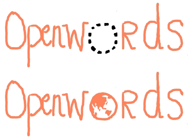
The logo will look like word "Openwords" with the second "o" replaced with one of several different Earth designs (see illustration below). The Earth design could then serve soley as the logo or as the icon for the app. This design is similar to the Facebook design.
We also have several other designs which do not incorporate the name "Openwords" 1, 4, 6, 7, 9, 10, 11.
Potential Openwords icon & logo format (These are sketches, the font can vary and will not be hand drawn)

This icon/logo/name concept is similar to the Facebook icon & logo


And now the possible designs.


Other concepts
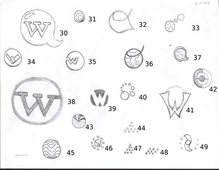
The designs below are not part of this round of voting - they did not go through the first round. These designs are new. If you like any of these, and think they should be included, let me know.
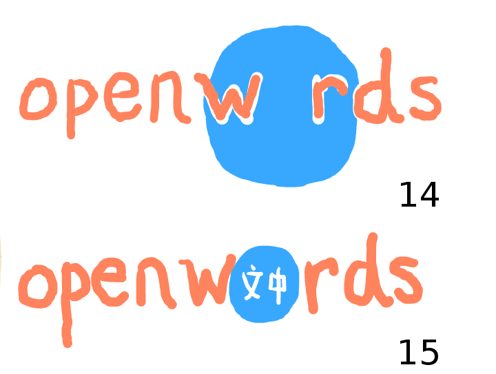
This concept is a variant on the second "o" replacement concept. The blue circle could be a blue Earth, slightly larger than an "o" that it replaces. Or the "o" could simply be a blue circle, and individual languages could be placed into the holder. The font of the "openwords" would not be hand drawn.

Here are some additional designs that were not in the first round of voting.


Concepts are from three people Chris Myles, Jim Keplinger, and Marc Bogonovich (me).
